Tuesday, November 26, 2013
Swim Team/Club Summary
I am going to design a logo for the Swim Club. I think I am going to try to design a Combination mark with both text and symbols. Since I'm in the Swim Team and Club I don't have much questions because I know what the club is about. The Swim Team starts from late August through early November. The Swim Team is a PSAL team that competes with other schools in meets either one on one or with multiple schools. The Swim Team is only for the Swim team members only. During the few months, the swimmers have a schedule that tells them when a meet is. When there are no meets, the swim team usually practices 3 times a week in the pool in Millennium Brooklyn. The team has students from both Millennium and Millennium Brooklyn and people are free to join the team. However, the Swim Team stresses heavily on commitment and a swimmer has to be able to attend practices in order to be able to swim in meets. The Swim Club is a club where people who don't know how to swim can come and learn from some of the Swim Team members and Ms. Simms. It is also for swim team members to practice despite Swim season being over. Swim Club is not very strict and people can come and have fun in the pool. Some adjectives to describe the Swim Club is easy going and dedicated. Some qualities of the club that can be represented through symbols are united which can be represented by a picture of people holding hands. Another quality of the club is easy going and a symbol for it can be a big mouth laughing. I think Slab Serif can represent unity because the typeface has a uniform thickness which is all equal. That shows that everyone on the Swim Team and Club treat everyone equally and we come together as one.
Sunday, November 17, 2013
Finding Type
Modern
It is a small store that sells food and magazines. The Modern type font is basically used to clearly identify what this store is.
I do think that it's appropriate since Modern type font is one of the easy to read fonts which is exactly what the sign was for.
 Oldstye
I'm not sure if I'm correct but it seems to be Oldstyle and italics. I think it's Oldstyle because it can go from thick to skinny in a diagonal way.
This is also used for in a sign in the store front. The font is used for promoting the name of the store.
This typeface is appropriate because the sign has to be clear but the owners probably also want to make it a little fancier by adding the italics.
 Slab Serif
All the letters have a uniform thickness so I think it is Slab Serif.
This typeface was also used for the sign in a store.
This was also appropriate because Slab Serif seems to be a common type used for sports because they are easy to read and very universal so that it can be applied to multiple sports.
 Sans Serif
The Canal St. sign is Sans Serif font.
This sign is used to identify what street it is.
It is definitely appropriate since they equal thickness throughout makes it easy to read so that people know where they are.
 Script
The Script font is used as the sign for a French restaurant.
Script is perfect for this restaurant because script looks very elegant and fancy which is really what a French restaurant tries to show.
 Decorative
This typeface is used again as the sign of a store/ restaurant (dessert bar).
It is decorative because one can instantly tell that it is unlike other fonts. Also, it is appropriate because I think it was designed to want to look quirky and unique like the dessert bar itself.

It is a small store that sells food and magazines. The Modern type font is basically used to clearly identify what this store is.
I do think that it's appropriate since Modern type font is one of the easy to read fonts which is exactly what the sign was for.

I'm not sure if I'm correct but it seems to be Oldstyle and italics. I think it's Oldstyle because it can go from thick to skinny in a diagonal way.
This is also used for in a sign in the store front. The font is used for promoting the name of the store.
This typeface is appropriate because the sign has to be clear but the owners probably also want to make it a little fancier by adding the italics.

All the letters have a uniform thickness so I think it is Slab Serif.
This typeface was also used for the sign in a store.
This was also appropriate because Slab Serif seems to be a common type used for sports because they are easy to read and very universal so that it can be applied to multiple sports.

The Canal St. sign is Sans Serif font.
This sign is used to identify what street it is.
It is definitely appropriate since they equal thickness throughout makes it easy to read so that people know where they are.

The Script font is used as the sign for a French restaurant.
Script is perfect for this restaurant because script looks very elegant and fancy which is really what a French restaurant tries to show.

This typeface is used again as the sign of a store/ restaurant (dessert bar).
It is decorative because one can instantly tell that it is unlike other fonts. Also, it is appropriate because I think it was designed to want to look quirky and unique like the dessert bar itself.

Tuesday, November 12, 2013
Michelle Obama in Times Square!

Sunday, November 3, 2013
Sky!

Letter to Symbol GIF- Reflection Questions
1.While using Gimp, what was most frustrating aspect of the program and/or project? (Ex. Gimp Tools, translating sketch to design, creating transitional layers, etc.)
The most frustrating aspect of the program was definitely how to use the Gimp tools to properly translate my sketch onto Gimp. I find myself constantly having to redo a slide or get stuck trying to finish a slide because the tools were not working properly and I ended up messing up that specific slide. Also, there are times where I didn't know which tool to use in order to get the perfect shape or image that I wanted the slide to be. The Gimp tools were rather complicated to use since there can be multiple features within one tool that really just ends up confusing me even more.
The most frustrating aspect of the program was definitely how to use the Gimp tools to properly translate my sketch onto Gimp. I find myself constantly having to redo a slide or get stuck trying to finish a slide because the tools were not working properly and I ended up messing up that specific slide. Also, there are times where I didn't know which tool to use in order to get the perfect shape or image that I wanted the slide to be. The Gimp tools were rather complicated to use since there can be multiple features within one tool that really just ends up confusing me even more.
2.After completing the project, which Gimp tools do you feel most confident in using? Explain why.
After completing my GIF, I feel the most confident in using the Paths tool since I used it the most for my GIF. I am now able to create the shapes that I want with the Paths tool and I used the Paths tool for 70% of my GIF. I am the most confident in it because I feel like I can now easily use some of the features within the paths tool. I had to use the subtraction feature a lot for my Pacman mouth. At first it was hard since I couldn't tell whether it was subtracted or not but now I think I can use it with ease.
3.Which Gimp Tool do you wish you were better at using? Explain why.
I definitely want to better at using the Lasso tool. It is because I haven't used it that much on my GIF so I'm not familiar with it. Also, I find it hard to use since I can never seem to get it the shape or form that I want it to be. The Lasso tool seems like a very useful tool and I want to learn how to use it better so that I can create shapes that don't just have to be circles and rectangles.
4.What would you like to create with Gimp next?
*If you do not like Gimp then asnwer the following: What kind of projects/artwork will Gimp be most useful? Explain why.
I think Gimp will be most useful for adding things onto a photo. What I mean by that is I think its's most useful for adding creativity to a photograph. For example, a photo of the New York Skyline; someone can use Gimp to add a helicopter in the photo or something. I think Gimp is useful for editing photos because there are tools like the scissors or the subtraction tool that makes it easier to do so.
Friday, November 1, 2013
Pacman!!!!!!!! GIF Project!

I know it's not great, but it's my first time with GIMP! As a technology idiot (I'm not even joking; I can barely understand how to use my new smartphone) I thought I did a pretty darn good of a job on my Pac-man GIF! hehe
Monday, October 28, 2013
Doing Homework...The Struggle
Every student's got those days where you just can't stay awake to finish your homework. Here's a glimpse of my daily homework routine...


Feel free to accompany this gif with this as the background music:
Monday, October 7, 2013
Instrumental
Sunday, October 6, 2013
Reflection of Name Project
1. Describe the design process in the name design project. How was it helpful or not helpful for you?
The design process was very helpful for me. I thought the photocopying our drafts step was very helpful since it allowed me to test out different color patterns and experiment with other changes. The photocopies allowed me to freely make changes without worrying that I messed up my original design.
2. How does the name design represent you? What components did you use to visually tell the viewer about yourself? (Composition, font style, images, symbols, colors, etc)
My design composes of colors black, white, and yellow. Despite the fact the fact that my favorite color is yellow, I also used it as a symbol of royalty. It goes with how I put crowns on my initials. Also, yellow beams sprout out of my name which kind of means that I like to shine above others to show that I'm me. That was actually my theme that I wanted the viewers to know about me. I wanted the viewers to know that I value myself very highly, almost princess like. I know I might be sounding very narcissistic but it just means that I care about myself a lot. Also, it doesn't help that I'm the youngest in my family and that I have an inside joke with my friends that I have a princess attitude(I'm not bratty though).
3. How did you create a focal point or emphasis in your design?
I created my focal point by making my initials larger than the other letters and I added the crowns on only the initials.
4. What was the most difficult part of this project for you? Why?
The most difficult part of this project for me was to actually think of the design that represents me. It is because I had a lot of ideas but it was difficult to create one that wasn't just pretty but actually represents me.
5. Are you satisfied with your project? Explain your answer.
I am pretty satisfied with my project because I know that I've went a long way and my design went to multiple changes compared to my first draft and final. I'm proud and satisfied with it since I know that I was able to capture/ create an image of my name that identified a part of me that normal people wouldn't have seen.
6. If you can change anything, what would you change?
If I could change something I think I would have fixed the pencil lines from the yellow beams. I wanted to try to find a way to cover up the pencil lines since they are still visible in my project.
Tuesday, October 1, 2013
My Inspiration!!!!!!
The Sky!!!!
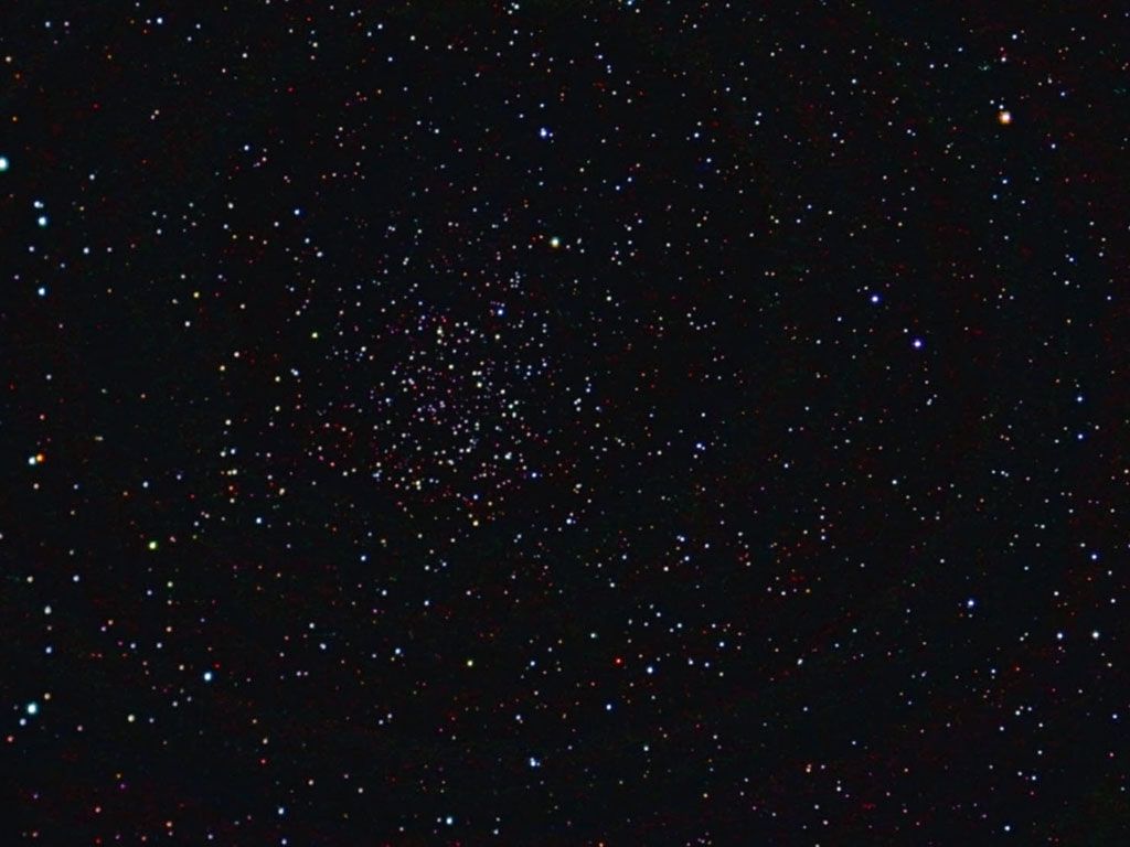
Inspiration sprouts anywhere and at anytime for different people. However, for me I find most of my inspiration from the sky. I think it is really easy to tell that I have a fondness for the sky (my background of the blog). The sky in general is so vast and infinite. The sky inspires me because it is so simple yet there are infinite possibilities that are yet to be discovered. The sky inspires me to continue to discover new ideas. Actually, last year was the first time I ever saw a night sky that was full of stars. Even now, I can still see it inside my head. It may be something other people tend to see every night but for a city girl like me, I was moved by the simplistic elegance of it. Whenever I look at the sky, whether it is the clear blue sky with puffy white clouds, cloudy gray sky, or the black sky with glistening stars: it gives me hope of endless possibilities.
Wednesday, September 25, 2013
First Entry!
Kelly's First Entry:
What is your experience with Graphic Design?
The only kind of experience I have with Graphic Designing is Paint on the computer. I never tried other programs like photoshop before so I don't have much experience in Graphic Design.
Why is graphic design valuable to learn?
I think graphic design is valuable to learn because it can be very useful in the future. It would be very inconvenient if I had to create/design a card or poster and I have no idea how to do it.
What is your favorite font type? Post an image or an example.
My favorite font type would probably be Papyrus.

What are your expectations for this course this year?
My expectations for this course this year would be to enjoy myself while learning how to design digitally. I also expect to walk out of this class with confidence in creating my own graphic designs in the future.
Subscribe to:
Posts (Atom)